Responsive Font-Sizes In React Apps
Best CSS practice to ensure consistent styling in web applications
We live in a mobile-first world and hence as a front-end developer it is our job to ensure that the web-apps we are building are mobile-friendly. With the rise of hybrid frameworks, things that are developed for web are easily translated to Android and iOS applications.
This shift in the development community has not only reduced the cost of shipping products but has also increased the speed at which these products are being shipped. Having responsive apps thus becomes far more important today. There are a ton of ways to style your react apps but for making your web apps responsive, you need to have your fundamentals clear!
Pre-requisite to understanding responsive layouts
Copy-pasting this little hack will serve the purpose but that is not how true developers work, and if you are reading this, I know you are are legit developer! So, please understand the underlying principles first and then implement it.
With this little hack, you can ensure consistent:
- Spacing
- Fonts
- Image sizes
across your web app. This one little hack will require you to use a CSS pre-processor like SCSS or SASS.
As a pre-requisite, you need to understand relative CSS length units
pxemremvh/vwvmin/vmax
Relative length units are relative to something else, perhaps the size of the parent element’s font, or the size of the viewport. The benefit of using relative units is that with some careful planning you can make it so the size of text or other elements scales relative to everything else on the page.
- MDN Web Docs
There are 18 relative CSS length units and you can read about them here. But for this little hack, all we need to understand rem .
CSS REM — What is REM in CSS?
Any CSS value that is measured in rem is measured relative to font-size of the root element.
TLDR: Using
remandemunits is better than using px.
rem stands for root em and it means “root element’s font size”. As web developers we need to understand that our apps will be used by all types of users — young, old, specially abled, and thus we need to take care of accessibility. rem helps us to maintain that accessibility.
Why not px ? The disadvantage with using px with everything like padding, margin and font-sizes is that the UI does not scale proportionately. This is where rem shines. It helps the UI to scale proportionately.
The root font-size is 16px. So, when we encounter a value of 1rem , we mean 16px
When to use rem and when to use other relative CSS units?
I personally use rem for font-sizes and em for margin and padding . You care read more about it here.
There are solid reasons to use rem and not em for font-sizes. While re-searching about this blog post (yes, I do my homework!), I came across this very detailed analysis on rem on font-sizes. Please go through it once and thank me later!
Use Rems for Font Size to Respect User Preferences by Aleksandr
How To Use REM In CSS
There are multiple ways to use rem in your front-end applications. This is not something specific to React. You can use it with any web-applications.
Some of them, from the same article above are:
- Work out the math by hand (e.g.,
24 / 16 = 1.5rem). - Use a CSS calc expression (e.g.,
calc(1rem * 24 / 16)). - Use a CSS preprocessor like Sass and write a custom
to-remsutility function. - Use the 62.5% font size trick to make the math easier.
Here, we’ll be discussing the third in the list i.e Use a CSS preprocessor like Sass and write a custom to-rems utility function.
As I have already pointed out that we need to use a CSS preprocessor for this. I am going with SASS.
This is a utility function wherein you just pass the value in px and the function returns the rem equivalent.
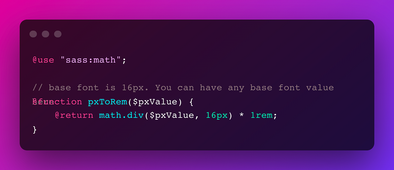
Consider this situation:
You are working with a UI/UX designer and the designer provides you with a Figma file. Your job is to convert Figma designs in front-end code, but in a responsive manner. Now the font-size values can vary for different designs and screens and hence you cannot have a pre-determined CSS variables. This is where the CSS utility method pxToRem will come handy!
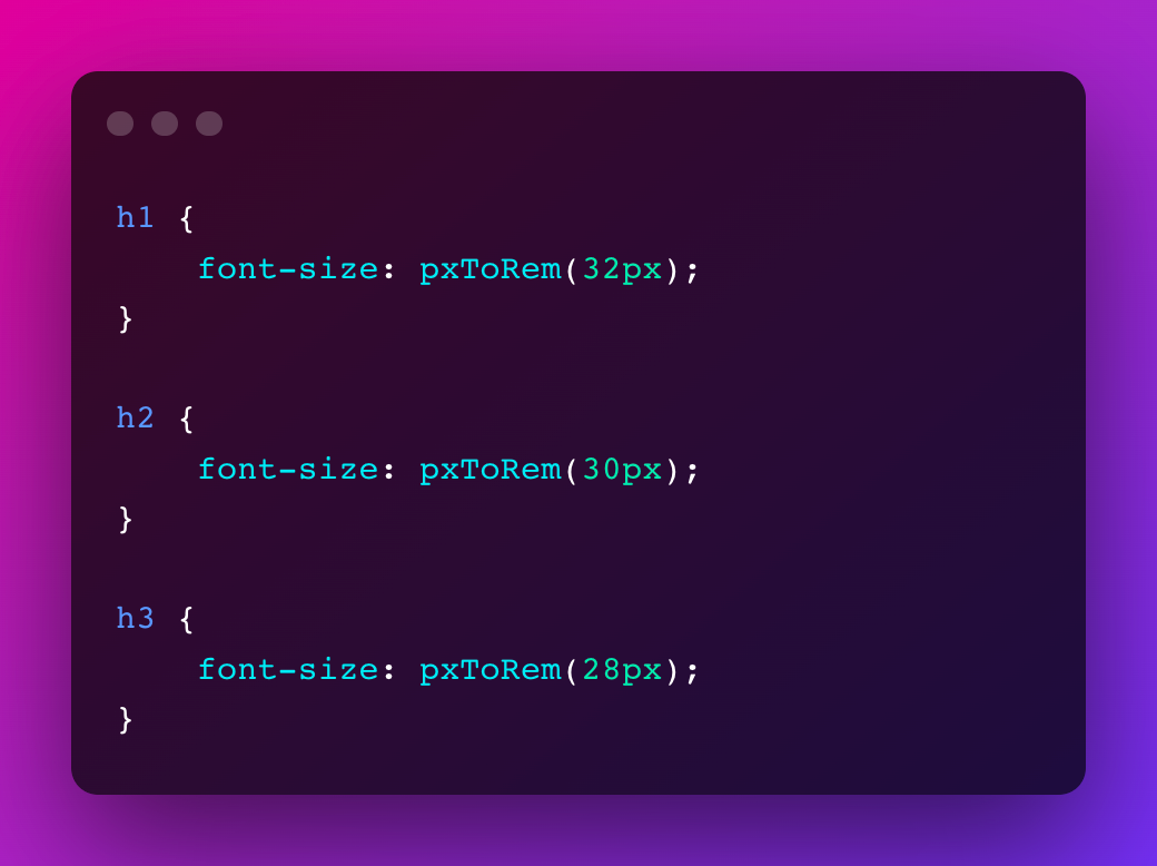
You can use this function like this:

Need for a utility function
Getting rem values for px values like 16px, 32px, 8px is easy for a root font-size of 16px. It will be 1rem, 2rem, 0.5rem.
But what if we want to capture font-size values of 15px, 35px, 7px? I certainly cannot divide 15/16 and come to a floating value with proper rounding off at a moments notice. But it might be easy for you. So, kudos to the “genius” in you!
Not everyone is a genius like you! I certainly am not!
Now, for dumb people like me who are not math wizards and are able to do the calculation on the fly, we need a simple utility function.
But for a math wizard/genius like you, all you need to do is divide the value in px you want to convert in rem by the root font-size.
So, if the root font-size is 16px then the utility function can give back rem values pretty easily. All we have to pass is the font-size values from the Figma designs.
Why Not To Use EM For Font-Sizes in CSS?
I’d like to cover this part as well so that you can appear smart in-front of your peers when they attack you with this questions!
So,
emcalculates the value relative to its parent element with an explicitfont-sizeTherefore it will take the relative value from it’s closest common ancestor with any explicit font size value. So even if it’s container or container’s container had an explicit font size set, it will use that value
- A very thoughtful comment
Let me show via an example, where things can go south when using em for font-sizes:
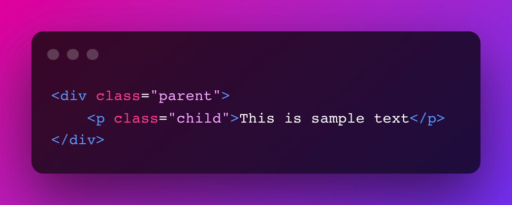
Now we give a font-size to the parent element. The child element will consider parent’s i.e closest common ancestor with an explicit font size value as its base for the calculation of rem
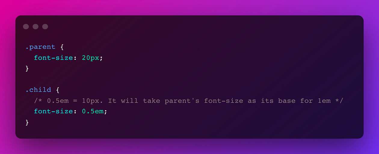
But, this can create an issue as you can see here. Different parent elements can have different explicit values for font-sizes and hence it will lead to different results for the same 0.5em values in children elements.
The issue becomes even more serious with nesting:
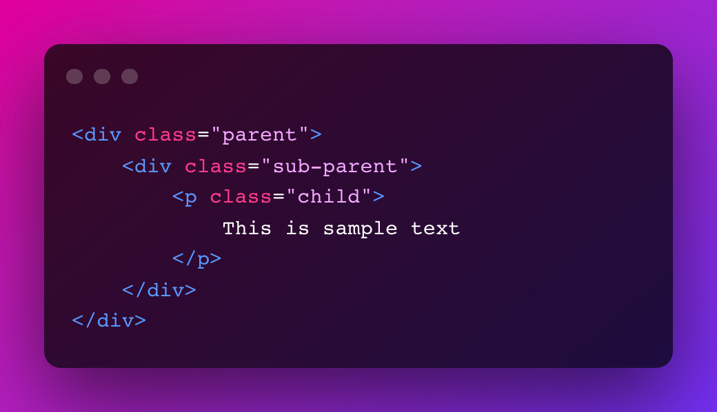
If we give font-size to parent and sub-parent , the child will get the nested value in terms of em
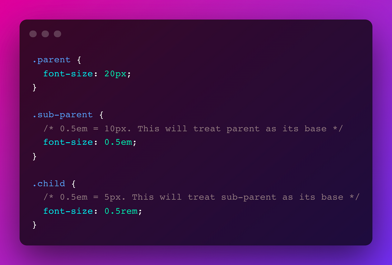
Hence, we cannot use em for font-sizes.
Other ways to use REM in CSS for responsive web apps
The above is just one of the ways to use rem for your web applications. There are other ways as well. Please feel free to explore them here.
- The 62.5% Font Size Trick
- Work out the math by hand (e.g.,
24 / 16 = 1.5rem). - Use a CSS calc expression (e.g.,
calc(1rem * 24 / 16)).
Thanks for reading ❤
If this blog was able to bring value, please follow me here! Your support keeps me driven!
Originally published on adityatyagi.com
Want to connect? Follow me on Twitter and LinkedIn or reach out in the comments below!
My name is Aditya. I am a Senior Software Engineer - II (Frontend). I blog about web development!
